Releases
Alle veröffentlichten Flow-Releases mit ihren Highlights, Migrationshinweisen und den enthaltenen Fixes. Wie du ein Update einspielst, beschreibt Upgrades.1.4.0 – Select all in menus and filters, file uploads in the MarkdownEditorMinor
Highlights
ContextMenugetsshowSelectAllfor multiple selection, andListfilters offer "Select all" from six values on (#3274).MarkdownEditortakes files by drop, paste or a toolbar button and inserts them as markdown at the cursor (#3265).Imagehas rounded corners by default;withBorderonly draws the border now, in a quieter color (#3266).CopyButtongetsonCopy, called with the copied text once it is in the clipboard (#3282).Actionwith a barecloseOverlaycloses the overlay it sits in, whatever component that is (#3191).- The
upgradeandlistcommands of@mittwald/flow-codemodsreport which peer ranges the Flow packages ask for (#3204).
Select all in ContextMenu and List filters
Picking all but one value of a long filter used to mean clicking almost every option. With showSelectAll, a ContextMenu in selectionMode="multiple" starts with a "Select all" entry. It selects every enabled item, reads "Deselect all" once everything is selected, and shows as indeterminate for a partial selection. Each click fires onSelectionChange once with the full set.
List filters in some mode turn it on from six values on, both in the filter menu and in the all-filters modal. MenuItem gets an isIndeterminate prop for the same state. An older host ignores showSelectAll and shows no entry.
File uploads in the MarkdownEditor
Pass uploadFile and the MarkdownEditor accepts files dropped onto it, pasted into it, or picked with the new attachment button in the toolbar. A placeholder goes to the cursor right away. When your promise resolves, it becomes an image embed or a link; when it rejects, the placeholder disappears. The upload itself stays with you — endpoint, auth and error handling — while Flow handles the interaction and the screen-reader announcements. It works in mStudio extensions too.
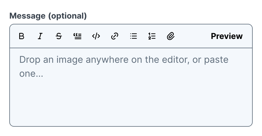
Image corners and borders
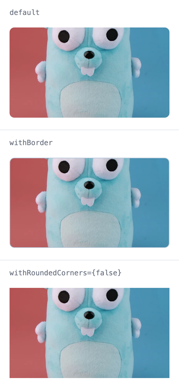
withBorder now only draws the border. The new withRoundedCorners prop (default true) controls the corner radius on its own, so every Image is rounded unless it opts out. The border uses the same color as Separator and no longer stands out in dark mode.
Smaller additions
CopyButtoncallsonCopy(text)after a successful copy and not when copying fails, so it counts copies, not clicks. It works in mStudio extensions as well.<Action closeOverlay>closes the nearest enclosing overlay. A dismiss action no longer has to name the surrounding component; an explicit name likecloseOverlay="Modal"still wins.- A new
AIHostingicon, for AI Hosting specifically.Sparklesstays the general AI icon. npx @mittwald/flow-codemods@latest upgradeandlist <revision>print the peer ranges of the Flow packages you use, marked required or optional, before the install.list --jsoncarries them aspeers.
Migrations
Image without withBorder is rounded now. To keep square corners, pass withRoundedCorners={false}. No other code change is required — see MIGRATION.md.
Fixes
- 1.4.23 – components: flag hardcoded flow-- class names that nothing generates (#ad7e7ac)
- 1.4.22 – Overlay: keep typed dates when react-aria appends a hidden node to body (#26403a0)
- 1.4.21 – deps: bump the production group across 1 directory with 13 updates (#af37f4d)
- 1.4.20 – LayoutCard: space alerts stacked directly in a LayoutCard (#b4a0a1c)
- 1.4.19 – deps-dev: bump the dev-patch group across 1 directory with 16 updates (#21b2626)
- 1.4.18 – ActionGroup: keep multiple abort actions together at the start (#16c3464)
- 1.4.17 – structure modal content with Section (#860bad0)
- 1.4.16 – components: keep typed dates and times while a remote value is on its way (#e1e2bf6)
- 1.4.15 – ext-bridge: allow minor updates of @mittwald/react-use-promise (#7247a48)
- 1.4.14 – DatePicker: keep the calendar closed inside a popover (#a702b4f)
- 1.4.14 – align global search with mStudio search (#f964961)
- 1.4.13 – route app builders to USAGE.md from every repo entry point (#8fb4670)
- 1.4.12 – CodeEditor: reference label and description only while rendered (#bf96178)
- 1.4.12 – FieldError: link field errors to their control while shown (#3abb135)
- 1.4.12 – FieldError: stop leaking messages into other fields (#031dd4a)
- 1.4.12 – FieldError: stop remounting the error on every field render (#7b51522)
- 1.4.12 – PasswordCreationField: link a valid password's result to the input (#9280413)
- 1.4.12 – PasswordCreationField: show a generated password's rating at once (#f7c203e)
- 1.4.12 – PasswordCreationField: show danger on the bar while the field is invalid (#42627ef)
- 1.4.11 – repo: solve six documented footguns at their root (#9e2fe6f)
- 1.4.10 – ext-bridge: name the likely cause when the host never connects, use local timeout (#7b86979)
- 1.4.9 – deps: bump the production group across 1 directory with 14 updates (#d0b2526)
- 1.4.8 – List: keep tile images square at the bottom (#ecc88fc)
- 1.4.8 – keep the App Shell header and sidebars in view (#2d0f248)
- 1.4.8 – commit-guard: allow breaking changes on a major line (#4d9ebdd)
- 1.4.7 – Accordion: animate the content height instead of the grid rows (#d16e177)
- 1.4.6 – Button: expose muted presses as aria-disabled (#90bbfa3)
- 1.4.5 – ContextMenu: pass labeling props to the menu instead of the popover (#e0e1756)
- 1.4.5 – deps: bump the actions group with 2 updates (#856a840)
- 1.4.5 – MarkdownEditor: gate the attachment button scenario below 1.4.0 (#d25c061)
- 1.4.4 – deps-dev: bump eslint from 10.10.0 to 10.11.0 in the dev-minor group (#aff66cd)
- 1.4.3 – Slider: place the initial marker at the inline start (#fbb6ec2)
- 1.4.2 – MarkdownEditor: keep the preview height across re-renders (#cc1e148)
- 1.4.1 – Flex: let a className override the layout props (#a4ea169)
1.3.0 – CodeBlock folds smoothly, forms opt out of the close confirmationMinor
Highlights
CodeBlockanimates showing more and less: height, fade and button move together, and the collapsed code runs under the show-more button (#3290).FormtakesconfirmModalCloseOnUnsavedChanges={false}to keep a single form from asking before its modal closes (#3289).ComponentDefaultsProvideris available to remote apps (#3289).- The
Accordionexpand animation eases out.
CodeBlock
Toggling show more / show less used to switch the height instantly. The height, the fade and the button's position now animate together with the same timing as other expanding content. Code that grows after it was expanded is not clipped, and with reduced motion the block switches without a transition. The line numbers fold with the code, and the button sits closer to the bottom edge.
Form and ComponentDefaultsProvider
A Form inside a Modal asks for confirmation before the modal closes while the form has unsaved changes. Set confirmModalCloseOnUnsavedChanges={false} on a form that should not trigger this. The prop overrides the Form.confirmModalCloseOnUnsavedChanges default of a ComponentDefaultsProvider, which mStudio extensions can now import too.
Both first shipped on npm with 1.3.1.
Fixes
- 1.3.13 – components: move style computations from JS to CSS (#bab8880)
- 1.3.12 – Rating: round decimal values to the nearest segment (#b6a0c0a)
- 1.3.11 – react-tunnel: fill the exit before paint when it mounts in a Suspense reveal (#28676af)
- 1.3.10 – Calendar: stop the preset menu from growing on every layout (#3cee28e)
- 1.3.9 – carry the template rule into component-index and llms.json (#9573480)
- 1.3.8 – tell coding agents to start from a template (#9e2566b)
- 1.3.7 – ColumnLayout: keep the column ratio when content is wider (#abb824b)
- 1.3.6 – Label: keep label buttons out of the field's accessible name (#f395601)
- 1.3.5 – List: compose filter UI through views in remote context (#e218d14)
- 1.3.4 – codemods: mark form-resets-after-modal-close as applying to the remote package (#79ce51e)
- 1.3.3 – CheckboxButton: keep label left-aligned and fill the row height (#5efc008)
- 1.3.2 – docs: stop react-live from remounting the example preview (#1a1652d)
- 1.3.1 – Tabs, TabNavigation: measure against a scaled container (#b274a2b)
1.2.0 – Hints that point at the right control, and bars in the chartMinor
Highlights
CoachMarkis a new overlay that points at a control on its own — for a feature that is new, moved or easy to miss. It leaves the page usable and can be anchored byid, so an mStudio extension can place one (#3166).CartesianChart.Baradds bar series, stacked or grouped, plus alayoutprop that turns the chart on its side for horizontal bars (#2880).Badgetakes aContextualHelpdirectly — no trigger to write, no button to style (#3049).Headingplaces aButtonorCopyButtonwritten in its content beside the text, scaled to the heading (#3136).List.Itemgets adependenciesprop so a stable render function can declare the external state it reads (#3139).- Every popover now keeps a gap to the viewport edge, and a
widthyou set reaches the content instead of leaving empty background beside it.
CoachMark
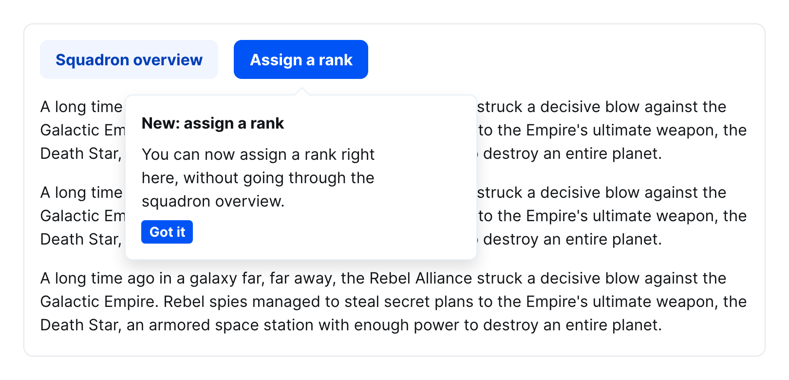
A coach mark points at a control the user did not ask about. It opens on its own and stays out of the way: the page below keeps scrolling, focus is left alone, and the hint rides along with its anchor instead of closing at the first scroll. Write it directly behind the element it points at — it then follows that element in the reading order, and the anchor refers to it through aria-details.
Anchor it with anchorRef where you have a ref, or with anchor where you do not. An mStudio extension renders in a different context than the host, so a ref never arrives, but an id does — the coach mark keeps looking until that element appears, which matters because the host materializes the page in pieces.
The component is remote-capable and marked beta.
Dismissal is composed, not configured: wrap the button in an Action — Flow never closes an overlay on your behalf.
Bars in CartesianChart
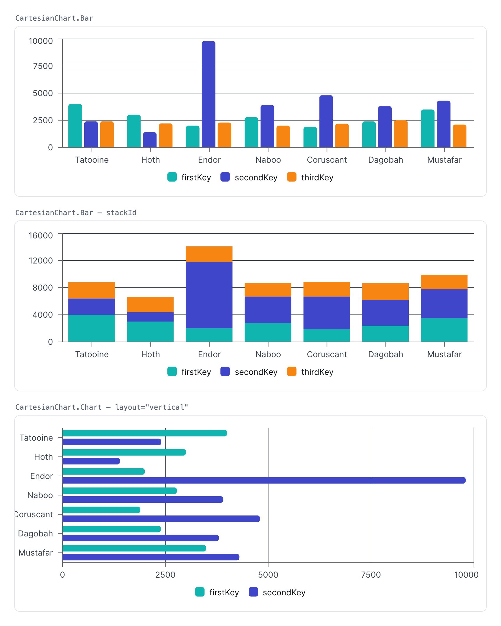
CartesianChart.Bar renders a bar series. Give several bars the same stackId to stack them; leave it off to group them side by side. Bars pick up the categorical color scale and round their outer corners.
The chart's new layout prop decides which axis is the categorical one. "horizontal" (the default) keeps bars growing upwards; "vertical" turns the chart on its side. XAxis and YAxis follow the layout on their own — only the dataKey moves to whichever axis is the categorical one.
Bar is remote-capable.
Contextual help in a Badge
Write a ContextualHelp into a Badge and the badge supplies the trigger button itself, colored and sized to match:
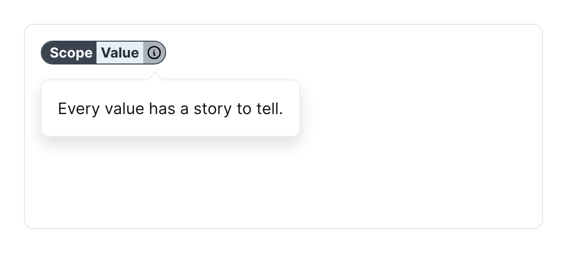
A ContextualHelpTrigger you write out yourself lands in the same place and is styled the same way, so you keep control of the trigger when you need it.
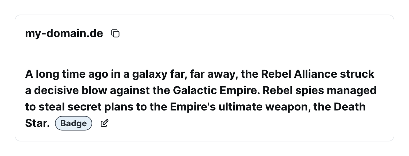
Buttons in a Heading
A Button or CopyButton written in a heading's content is now placed beside the heading text and scaled to the heading's size — m for the two largest sizes, s below.
Declaring what a list item reads
A List.Item re-renders when its data changes, or when one of its render functions changes identity — which a function written inline in JSX does on every render. A render function with a stable identity (hoisted out of the component, wrapped in useCallback, or reading from an external store) gave the item no signal at all, so it kept the values it first saw. dependencies is how you give it one:
A /tunnel entry point
@mittwald/flow-react-components/tunnel re-exports the @mittwald/react-tunnel API through the very module instance Flow uses. The tunnel's context is module-level, so a consumer's own dependency on @mittwald/react-tunnel becomes a second context as soon as the versions diverge, and entries stop finding Flow's providers. Import from this entry point instead of from the package directly (#3176).
Fixes
- 1.2.28 – Popover: render the tip from one component (#c764de4)
- 1.2.27 – Link: inherit the font size of the surrounding text for inline links (#9490b0b)
- 1.2.26 – components: subtle micro-interactions for interactive components (#fc68bcc)
- 1.2.25 – components: invalidate build when the design tokens change (#fc70f93)
- 1.2.24 – Accordion: name the toggle of a label header (#c526710)
- 1.2.23 – point llms.txt at the Markdown pages and add extension guidance (#39831cf)
- 1.2.22 – List: make infiniteScroll work in table view mode (#bd171f8)
- 1.2.21 – Popover: lift a non-modal popover over ordinary page content (#7705faa)
- 1.2.20 – components: animate DonutChart, ProgressBar and chart on load (#10f85d9)
- 1.2.19 – components: make the selector lint rules blocking and gate :global class names (#c7a0262)
- 1.2.18 – codemods: stop one empty source file failing a whole upgrade (#36dc53f)
- 1.2.17 – components: stop declaring query containers nothing queries (#c4d03bf)
- 1.2.16 – Overlay: keep focus and scroll position when something appends to body (#e9554f6)
- 1.2.15 – deps: bump the production group across 1 directory with 19 updates (#453d99f)
- 1.2.14 – deps-dev: bump the dev-patch group across 1 directory with 7 updates (#3463327)
- 1.2.13 – deps: bump the dev-minor and actions groups (#9c49710)
- 1.2.12 – FileDropZone: match dropped files against accept like the attribute does (#7118f1d)
- 1.2.11 – DonutChart: keep the value centred in a stretching flex row (#7267ac4)
- 1.2.10 – components: announce accordion state and gallery position (#62e4c41)
- 1.2.9 – remote-core: carry Date and other built-ins across the remote boundary (#534e62d)
- 1.2.8 – PasswordCreationField: make the field usable with a screen reader (#33fde0b)
- 1.2.7 – TextArea: resize and count a value the field never saw typed (#a0df423)
- 1.2.6 – components: compile the browser tests' base styles from source (#2320245)
- 1.2.5 – Tooltip: hide a tooltip that never got positioned (#81c1aff)
- 1.2.4 – Combine: keep a text and its small button in the line (#a9ae866)
- 1.2.3 – CoachMark: play the closing animation instead of vanishing (#75d9bda)
- 1.2.2 – components: invalidate build:icons when the icon source changes (#9978fa1)
- 1.2.1 – Tabs: keep collapsed tab titles out of the scrollable overflow (#7595357)
1.1.0 – Upgrade across Flow versions with one commandMinor
Highlights
npx @mittwald/flow-codemods@latest upgradebumps every Flow dependency, installs, and runs the codemods for the range it crossed.- The new
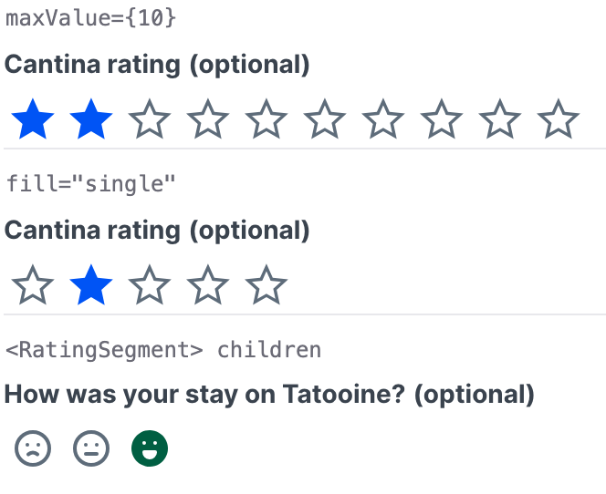
@mittwald/flow-codemodspackage carries the migration catalogue thatMIGRATION.mdis generated from — 23 entries, each carrying a codemod where the change can be applied mechanically. flow-codemods list <revision>shows what a target version would touch before you commit to it.Ratingtakes a segment count (maxValue), single-segment filling (fill="single"), and individualRatingSegmentchildren with their own icons and labels.@mittwald/flow-react-componentsnow shipsUSAGE.mdand a JSON component index, so a coding agent can answer component questions without the docs site.
The upgrade CLI
Upgrading Flow used to mean reading MIGRATION.md, deciding which entries
applied to your jump, and running codemods one at a time. The new
@mittwald/flow-codemods package does that for you.
upgrade detects your package manager, refuses to run on a dirty working tree
(--allow-dirty overrides), and reports every file it declined. --dry writes
nothing, --print shows the transformed output, and --json makes list
machine-readable.
The catalogue is the single source for both the CLI and MIGRATION.md: an entry
describes what changed and how to migrate, and carries a codemod when the change
can be decided mechanically. Entries without one still tell you what to do by
hand — for those, the prose is the migration.
Rating: segment count, single fill, individual segments
Rating gained maxValue (default 5) for the number of segments, and
fill="single" to fill only the selected segment instead of every segment up to
it.
For a scale whose segments are not interchangeable, pass RatingSegment
children — they define how many segments there are (maxValue no longer
applies) and each one takes its own icons and accessible label.
Both the component and RatingSegment work in mStudio extensions.
Documentation a coding agent can read
@mittwald/flow-react-components now ships its own consumer guide, and the docs
site is published in machine-readable form.
USAGE.md, shipped inside the package: how to build an application with Flow — component selection, layout and spacing, what is safe to depend on, and the mistakes that come up most. Available offline, which is what makes it usable from an agent's tool loop.@mittwald/flow-react-components/component-index— a JSON index of every public component with its lifecycle status and props.- The docs site at https://flow.mittwald.de serves
/llms.txt,/llms.json,/llms-full.txt, and every page as Markdown at/raw/<path>.md.
Point your agent at USAGE.md and the component index; it stops guessing
component names and props.
Fixes
- 1.1.53 – icons: drop the trailing separator from an icon's class attribute (#8a48c83)
- 1.1.52 – SectionHeader: render links in size "m" (#2151330)
- 1.1.51 – Popover: keep a gap to the viewport edge on a narrow screen (#e607168)
- 1.1.50 – Overlay: size the backdrop to the viewport, not the document (#7eb1589)
- 1.1.49 – Notification: keep the notification inside narrow viewports (#e35fc7a)
- 1.1.48 – Popover: report the open state instead of taking it over (#0524e54)
- 1.1.46 – deps-dev: bump vite-plugin-sass-dts from 1.3.37 to 1.3.39 in the dev-patch group (#22e3d6c)
- 1.1.45 – deps: bump cronstrue from 3.24.0 to 3.25.0 in the production group (#fd25656)
- 1.1.44 – codemods: stop migrations breaking asset imports and skipping the password-tools rule (#3fa8963)
- 1.1.43 – deps-dev: bump the dev-minor group with 11 updates (#7348ed6)
- 1.1.42 – deps: bump the production group across 1 directory with 19 updates (#443a3bc)
- 1.1.41 – icons: inline the Tabler icon path data instead of depending on @tabler/icons-react (#11be0f2)
- 1.1.40 – components: keep overlay trigger buttons inside their trigger (#7210212)
- 1.1.39 – components: keep field values controlled from the first render (#16c6981)
- 1.1.38 – MessageThread: restore list markers for ordered lists (#11ad06c)
- 1.1.37 – codemods: order the unit tests after the remote-components generator (#d9fa5ba)
- 1.1.36 – Image: keep sizing from style when no size props are given (#abfc5a6)
- 1.1.35 – deps-dev: bump the dev-patch group across 1 directory with 8 updates (#4b8a593)
- 1.1.34 – Markdown: clip striped table cells to the rounded corners (#a1ade85)
- 1.1.33 – deps-dev: bump the dev-minor group with 4 updates (#7e666d1)
- 1.1.32 – Activity: stop a deactivated subtree leaving its overlays on screen (#a6c613b)
- 1.1.31 – Option: stop every option landing in the collection twice (#f6a8d84)
- 1.1.30 – ci: render every commit type in the changelog (#8f28777)
- 1.1.29 – PasswordCreationField: update to stable v3 (#8c56d85)
- 1.1.28 – codemods: wrap bare function references passed to onAction (#bb98f3c)
- 1.1.26 – components: prefix the CSS properties Safari needs prefixed (#8b3536c)
- 1.1.25 – NotificationProvider: keep notifications interactive over an open overlay (#07ea00d)
- 1.1.23 – DateRangePicker: use the size scale for the date segment padding (#ce60e49)
- 1.1.21 – Navigation: keep the badge in the item's line and truncate the label (#825bcbc)
- 1.1.21 – Markdown: forward the react-markdown options it accepts (#953cb55)
- 1.1.20 – Option: infer textValue from mixed children and keep value stable (#e80bf3c)
- 1.1.19 – Tabs: keep the tab selection controlled from the first render (#dd29fa5)
- 1.1.18 – ListItem: render linked items as real anchors (#de6dc0a)
- 1.1.17 – Tunnel: render tunnelled children in the first commit (#09db004)
- 1.1.17 – Button: treat a string label like a Text child (#13cc756)
- 1.1.17 – components: keep tests and stories out of the published types (#bf947d9)
- 1.1.10 – Link: prevent text selection on icon element (#9f3160b)
- 1.1.9 – List: let items follow the state they are rendered from (#40e0401)
- 1.1.9 – codemods: colour the upgrade by-hand list and print summaries last (#a91daf3)
- 1.1.7 – codemods: add migration entry for Tabs' navigation-usage move to TabNavigation (#c1d45d4)
- 1.1.6 – codemods: install with the project's real package manager (#63875ae)
- 1.1.5 – docs: drop the classic JSX transform debug props from live examples (fixes #3017) (#64abb32)
- 1.1.4 – Heading: space tunneled content without :has() (#97022ee)
- 1.1.3 – codemods: the SegmentedControl -> RadioGroup direction is a rename (#0832a67)
- 1.1.2 – Tabs: forward aria-label to the tab list (#cad04b6)
- 1.1.2 – codemods: say that action -> onAction changes the callback type (#9a52148)
- 1.1.1 – codemods: compile the transforms so a consumer install can load them (#50f8075)
1.0.0 – Semantic Versioning is a promise now, not an intentionMajor
Highlights
- 1.0.0 carries no breaking change over 0.2.0-alpha.1058. Coming from the last alpha, the upgrade is a version bump and nothing else.
- Semantic Versioning is binding from here on: an incompatible change to the runtime public API only ever ships in a new major (ADR 0005, RFC #2711).
- Deprecate, don't break — an API that is going away stays functional and warns at runtime first. That warning is your lead time before the next major.
- Every
@mittwald/flow-*package keeps sharing one version, so the promise reads identically for all of them,@mittwald/flow-remote-react-componentsincluded. - Deliberately not covered, so the design system can keep moving: TypeScript types, CSS class names, design tokens, and the internal DOM structure.
- New docs page under Get Started walks through what the release means per audience and how to catch up from an older alpha.
Deprecations
Nothing is newly deprecated in 1.0.0. What changed is the removal date: every path deprecated during the alpha keeps working and now disappears at 2.0.0, not before.
Align→Combine(#2871)SegmentedControl/Segment→Tabs(switching content) orRadioGroup(setting a value) (#2903) — not mechanical, the replacement is a decision per usage- The global
flagsobject →ComponentDefaultsProvider, which also works per subtree (#2796) Button/SubmitButton:color="accent"→color="success"(#2874)Action:action→onAction
What the version number now guarantees
An incompatible change to any of these only appears in a new major: the runtime public API of public.ts (which components and exports exist, which props they accept, and the documented behaviour of documented functions), the props of the components in @mittwald/flow-remote-react-components, published icons, and the versioned remote protocol.
Node and React are runtime requirements with explicit rules. The Node floor is the actively supported LTS — currently node >=24 — and dropping a version still inside its LTS window is breaking, while dropping an already-EOL one may ship in a minor. Widening the accepted React range is backwards compatible; raising the minimum is breaking.
TypeScript types stay best-effort and are not covered, so a tsc error can in theory appear in a patch. If that would be expensive for your project, pin exact versions instead of ^ ranges. A deliberate type break still ships a migration note.
One override exists: a component's lifecycle status. A Beta component is exempt from the breaking-change promise while its API is still moving; Stable is the default and fully bound; Deprecated stays covered until it is removed in a major.
What it means for mStudio extensions
The props of the components in @mittwald/flow-remote-react-components are the contract with extension developers and carry the same promise as the React components. The remote protocol is versioned and negotiated when the connection is established, so an extension built against an older Flow keeps running when the mStudio host updates.
@mittwald/ext-bridge shares the version but has its own migration guide and a stricter Node rule: for that package, any raise of the Node floor is a breaking change, regardless of EOL, and its floor may be more conservative than the rest. Since the alpha it requires node >=24 and narrows its React peer range to ^19.2.0. Declared context parameters are typed and optional config values are never null any more, so reading config.containerId no longer needs a runtime narrow (#2889).
Migrations
From 0.2.0-alpha.1058 there is nothing to do. Coming from an older alpha, the work sits between the alphas, not in 1.0.0, and none of it is a prerequisite — the old paths still work in 1.x.
Every change that needs an adjustment in your code has a before/after entry in the migration guide of the package it affects:
- @mittwald/flow-react-components — also covers
@mittwald/flow-remote-react-components - @mittwald/ext-bridge
Entries are sorted by version, newest first. Find the version you are coming from and work upwards. The oldest 0.2.0-alpha entry is the jump to 0.2.0-alpha.646, so from anything around 0.2.0-alpha.600 the guides are complete.
How to work through them — and the codemod CLI that automates part of it — is on Upgrades.
Fixes
- 1.0.16 – components: stop shipping design-token build metadata to the browser (#7d3afde)
- 1.0.13 – Modal: keep the heading text next to its icon (#9ff2cae)
- 1.0.9 – Form: stop a Modal's form submit from reaching the surrounding Form (#ee9b60a)
- 1.0.8 – FileField: open the file dialog inside a link row (#b77a14c)
- 1.0.7 – Table: will not render in remote (#22929f4)
- 1.0.6 – docs: hide deprecated values from the properties table (#eaa0349)
- 1.0.5 – docs: show full prop types in the properties table (#2c42ad5)
- 1.0.3 – CodeBlock: balance the padding and unify the editor line colors (#6bf57c7)
- 1.0.2 – Remote: serialization allows duplicate object references (#ac3ef26)
- 1.0.1 – Breadcrumb: fix cursor pointer for spans with role link (#d44d61c)